Concept buildWebsite redesign · Before / after
Crumb Bakery redesign
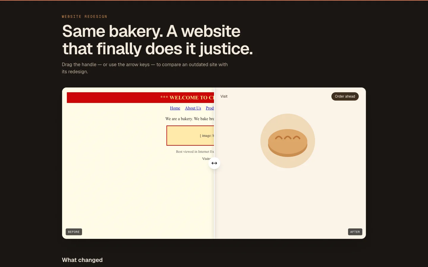
A before-and-after comparison of a dated site and its redesign.
01Overview
A concept build created to demonstrate website redesign. Crumb Bakery redesign is a fictional brand, so there is no client and no real-world results — it exists to show the design, interaction and engineering approach in a working, clickable site.
02The Challenge
Many small businesses are held back by a website that no longer represents them.
03My Role
Design & development — responsible for planning, building and shipping the product across the interface, backend and data layer.
04The Solution
A draggable comparison slider that shows an outdated bakery site beside a modern redesign, with what changed.
05Key Features
- Draggable, keyboard-accessible comparison
- Modern layout and type
- Mobile-first structure
- Summary of improvements
06Technology Stack
- React
- TypeScript
- Tailwind CSS
07Development Process
- 1
Define the brief
Chose a realistic scenario for the service and defined what the product needs to do.
- 2
Design the interface
Set a distinct visual direction, type scale and responsive layout.
- 3
Build it
Implemented in React and TypeScript with accessible, keyboard-friendly interactions.
- 4
Polish and test
Checked responsive behaviour, focus states and empty or error states.
08Screens / Visuals
09Lessons Learned
- A comparison slider must work with the keyboard.
- Redesigns should keep what already works.
- Clear structure beats decoration.
10Result
A complete, working concept demo you can open and use — built to show the approach, not to claim client results.
Need something similar?
Let's talk about what you're building.